Public profile#
This article introduces you to the public profile of your organizer in pretix and shows you how to customize it via the "Organizer page" and the "Shop design" tabs in the organizer settings. Possible customizations include a header image, website text, the default overview style for upcoming events, and links in the page footer. The public profile is available at https://pretix.eu/awesome-corp/ where "awesome-corp" is replaced with your organizer short form.
Prerequisites#
This article assumes that you have access to an organizer account, either because you created it yourself when you signed up on pretix.eu, or because you were invited and granted access by a co-organizer.
If you want to use a header image on your public profile, please prepare a .png or .jpg image. We recommend that it meets the following criteria:
- tells your customers who is organizing the event (i.e., contains your company name, logo, or recognizable design)
- no small details that may get lost when the image is rendered on small screens
- resolution of 1140 × 120 pixels or slightly smaller
- (alternatively: an image with a width of 1170 pixels or more)
We recommend that you make a final choice as to which languages the public profile will be made available in. Go to the Localization tab and choose your languages from the list before adding text or links on the Organizer page tab.
How to#
This section tells you how to define the contents of your public profile via the "organizer page" tab, and how to customize your color and font preferences via the "shop design" tab. It does not matter which tab you visit first.
Organizer page#
Browse to Organizers, then open navigation pathYour organizer then Settings and click on the Organizer page tab. This page lets you define the contents of your public profile. The organizer page is the public profile of your organizer. You can take a look at it by clicking the Public profile button in the bar at the top.
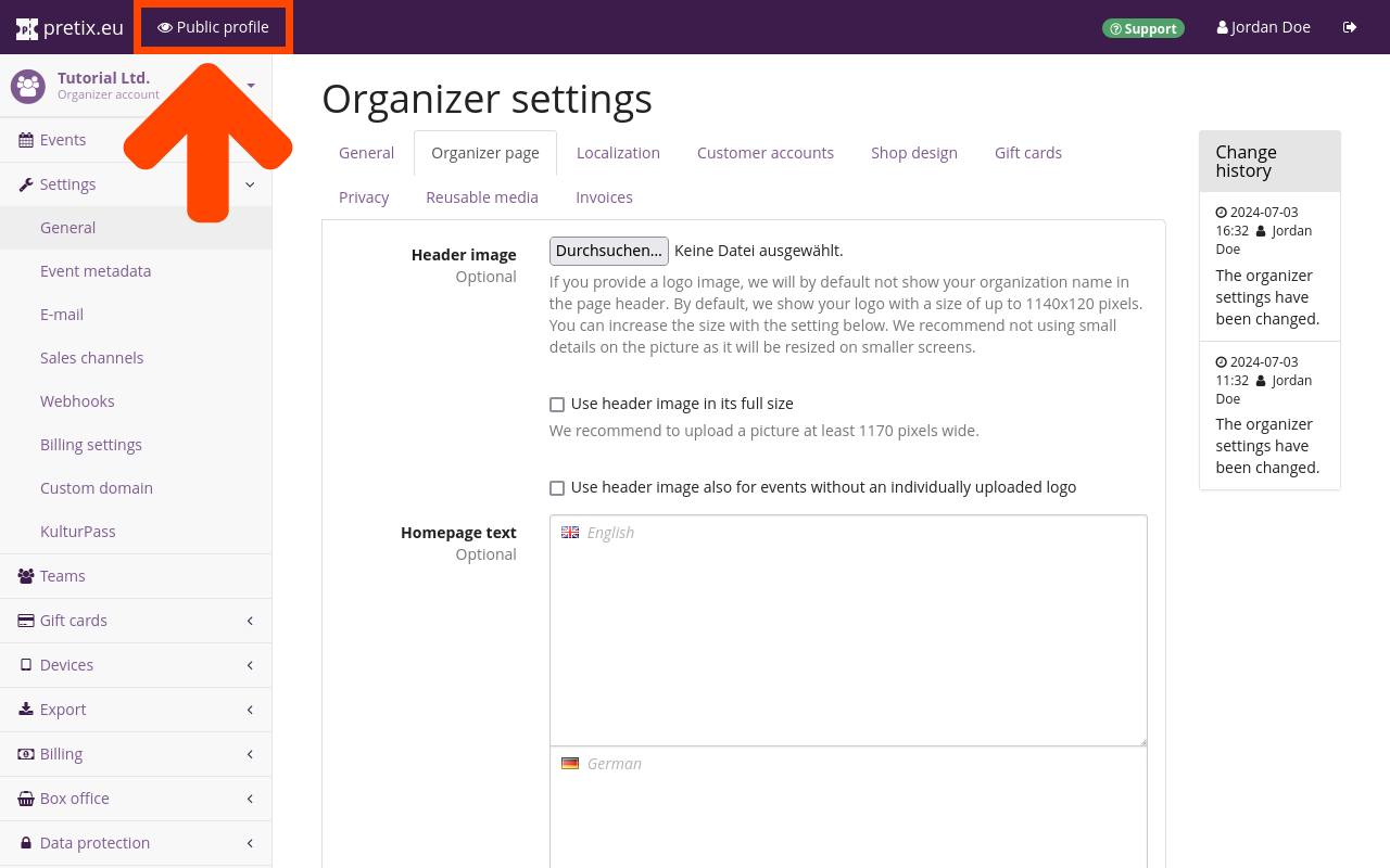
By default, the organizer name will be displayed in the page header of your public profile. The organizer page settings allow you to replace the name with an image. The image should be a .png or .jpg file with a resolution of 1140 × 120 pixels or slightly smaller. It should tell your customers who is organizing the event (i.e., it should contain your company name, logo, or recognizable design).
If you want to use a larger header image on your public profile, you should check the "Use header image in its full size" box. This option works best with images of 1170 or more pixels in width. In any case, we recommend not using an image with small details, since it will be resized for smaller screens. You can add the header image by clicking the Browse... button next to the "Header image" option and choosing the image file to upload from your computer. You are also given the option to use this header image on pages for events that do not have their own individually uploaded logo.
In the "Homepage text" fields, you can provide text to be displayed on your public profile. You will have one field for each language you activate in the "Localization" tab (see the next segment of this article). If you have more than one language enabled, your public profile will allow the viewer to switch between those languages via the links in the top right corner.
You can choose the "Default overview style" for events on your public profile from the drop-down menu. Events will either be displayed in a list, a weekly overview, or a monthly overview. The list overview style is only available if your event series has 50 or less dates in the future.
Shop design#
Browse to Organizers, then navigation pathYour organizer then Settings and click on the Shop design tab. All the settings on this page are purely optional as the default design is already perfectly serviceable and in line with the overall design of the pretix website. However, this page offers you the possibility to bring your pretix-powered online shop more in line with your own website's design.
You can freely choose four different colors for your shop design. The notification underneath the input field display one of three possible messages, depending on the contrast of the color you choose compared to the white page background:
- Your color has great contrast and is very easy to read!
- Your color has decent contrast and is probably good-enough to read!
- Your color has bad contrast for text on white background, please choose a darker shade.
Please heed these hints when choosing the design colors for your shop.
Note
High contrast is an important factor in your customers' ability to access your shop. They may be viewing your shop on a small device, a subpar screen, in high ambient light, or with visual impairment. Even a design that looks good to you in the public profile preview may not have high enough contrast for those cases. The notes underneath the color input field in the pretix software will help you ensure that the chosen colors have high enough contrast. Please do not ignore the note if it asks you to choose a different shade.
The primary color is used for headlines, links, and focus design elements. The default setting is a light purple which has fairly high contrast on white backgrounds and fits into the overall pretix color scheme.
You can customize the accent colors for success and for errors. We strongly suggest using shades of green and red here.
The page background color refers to the background and not the main body of the page. All text and elements will be displayed on the off-white main body, so you are free to choose a dark background along with dark primary and accent colors without sacrificing readability.